Conversion Focused Web Design for Small Businesses
You already have a website.
But it is not bringing you clients.
The problem is usually clarity.
I fix what is stopping visitors from taking action.
No pressure. No sales talk. Just clarity on what makes visitors hesitate.

- 15 Years Helping Businesses Get More Clients
- Trusted by small businesses across 256 website projects and consultations

Bianca Britney
👍 Fast, simple, beautifully done, and exactly what we needed.
When Your Website Finally Works
Connects With the Right People
Visitors feel understood and know they are in the right place.
Shows Up Where It Counts On Google
Turns Visitors Into Real Leads
Clear paths and focused messaging guide visitors to take the next step.
And for many business owners, this is where things quietly fall apart.
Does This Sound Familiar?
You’ve invested time, money, and hope into your website, but something still feels off.
- Visitors land on your site, then leave within seconds.
- You get clicks, but few turn into real conversations.
- Leads come in sometimes, but rarely become clients.
And It Could Be Different
- Your website speaks clearly about what you do.
- People quickly understand your value and offer.
- Your website brings clients and sales, not confusion.

Here’s What a Clear Website Audit Would Show You
![]() What is already working on your site
What is already working on your site
![]() What is quietly blocking people from taking action
What is quietly blocking people from taking action
![]() Clear, simple suggestions to improve it
Clear, simple suggestions to improve it
![]() A sample above the fold layout showing a better direction
A sample above the fold layout showing a better direction
Delivered to your inbox within 48 hours.
Once you see what’s happening on your site, the next steps become clear.
What Happens Next?
From there, we move forward in a simple, steady way.
CLARIFY
Turn confusion into clear next steps
Most websites do not fail because of design.
They fail because visitors feel unsure.
We focus on what matters most.
Your message.
Your offer.
And the next clear step.
Your website becomes easy to understand and easy to act on.
Includes
• Clear, conversion focused messaging
• Strong value positioning
• Landing page or funnel refinement
• SEO foundations for long term visibility
STABILIZE
Keep your site running smoothly and confidently
Your website should not become another thing you worry about.
Once everything is clear, I keep it running quietly in the background.
It stays fast, secure, and ready to convert without constant attention.
You get peace of mind while your website does its job.
Includes
• Ongoing site care and optimization
• Monthly conversion checkups
• Speed, security, and mobile upkeep
SCALE
Turn clarity into steady growth
When your site is clear and stable, growth becomes predictable.
We focus on visibility, stronger conversion paths, and steady improvement over time.
No guessing. No random tactics.
Your website becomes a system that supports long term growth.
Includes
• Conversion and funnel optimization
• SEO and content growth support
• Email and automation improvements
Real Results from Real Businesses Like Yours
This is what clarity looks like in real businesses.
Bianca Britney
Partner at Jonjesuniform
Fast, simple, and exactly what we needed.
Richard was easy to work with and very responsive. He got our site live quickly, it looks great, and it works smoothly across all devices.

Founder of Melaka Chetti Kitchen
Richard played a key role in our book launch.
He turned our ideas into a clear, conversion focused website. His fast turnaround and clear communication made everything smooth, and the site truly supported our goals.

Founder and CEO of Hannve Technology
Richard quickly understood what we needed.
He delivered a site that looks excellent and tells our story clearly. Even visitors unfamiliar with our field find it easy to use, and we have seen real growth since.

Event Planner at Goinvigo
From F to A in GTMetrix, that says it all.
Richard helped speed up my site, move to better hosting, and fine tune everything from WP Rocket to GeneratePress.

With a modern twist at 1garden.com
A breath of fresh air.
He quickly spotted ways to improve my site’s performance. Fast replies, spot on work, and excellent service. I will definitely be back.
Web Designer
Simply outstanding.
Richard boosted our GTMetrix and PageSpeed scores and made the site faster and fully optimized. Every issue was solved quickly and professionally.

Integrative Health Coach
This website audit gave me clarity and confidence.
After applying his advice, I received more discovery calls and finally felt clear about how to present my work and attract the right clients.

Stephen Chong
Branding and Marketing Strategist
He delivers fast, high quality work with strong attention to detail. What sets him apart is his ability to combine creative thinking with SEO driven structure for long term visibility.

Partner at Camden University USA
Richard was professional
He gave us strong confidence in our website security and stability. The student verification system is now more convenient, and the site runs smoothly across all devices. We would gladly recommend his services.
These are the tools behind the clarity and performance
Brands I’ve Worked With Along the Way
Every logo here represents a real problem solved and a lesson learned.
Stories That Shaped My Web Conversion Path
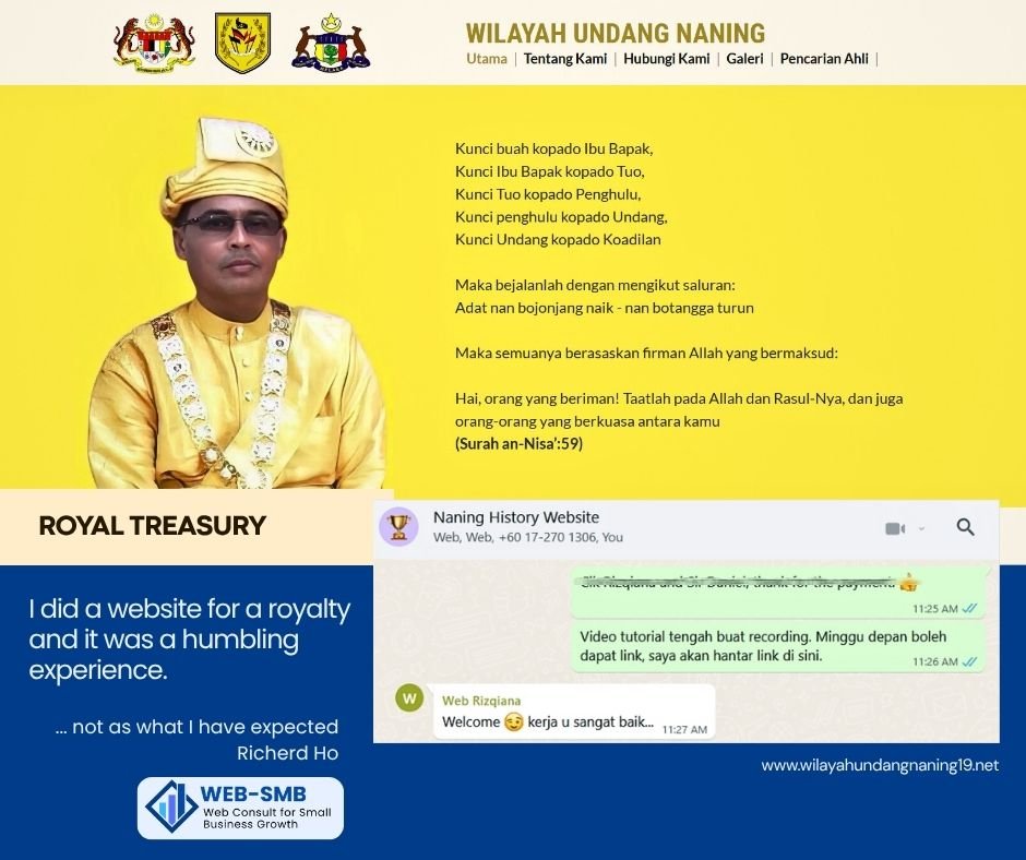
A Royal Lesson in Trust
I once built a website for a royal institution.
What surprised me was not the title or tradition.
It was the trust placed in my hands.
That project taught me this
A website is not just design
It is stewardship of a story that matters
That same care now goes into every small business I serve.
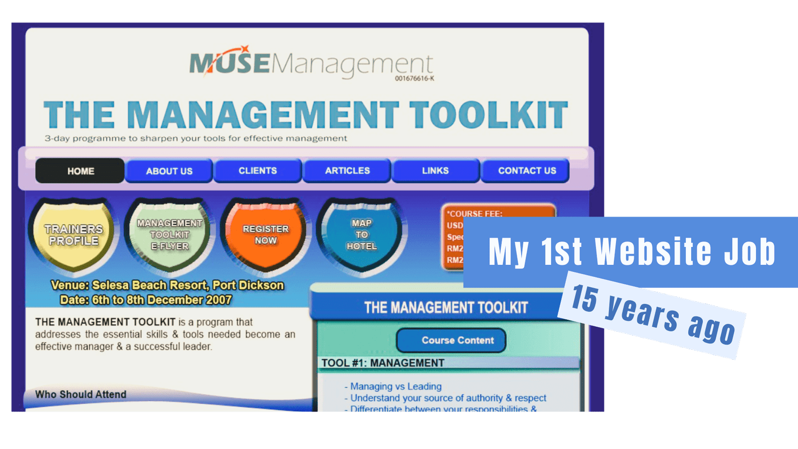
Where It All Started
15 years ago, I built my first website.
Slow internet. Simple tools. No roadmap.
It was not perfect
But it gave me belief
Belief that clarity can open doors
And that honest work compounds over time.
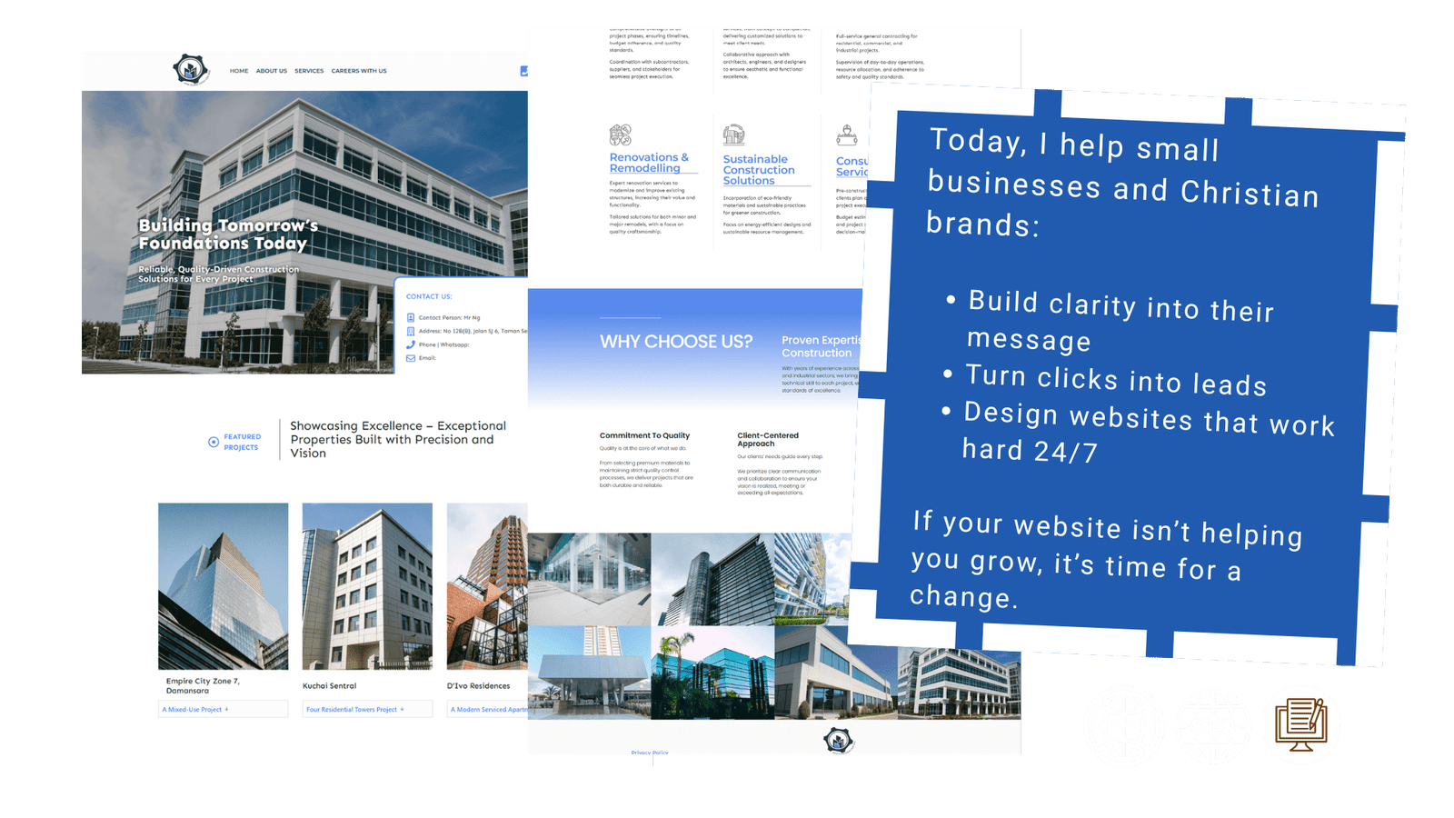
What I Build Today
Today, I help small businesses and Christian brands create websites that feel clear and grounded.
Websites that explain what you do
Earn trust naturally
And guide visitors to the next right step
Not noise
Not pressure
Just clarity that works.
These experiences shaped how I approach every website I build today.
Real Results Through Conversion Focused Web Design
Before : After
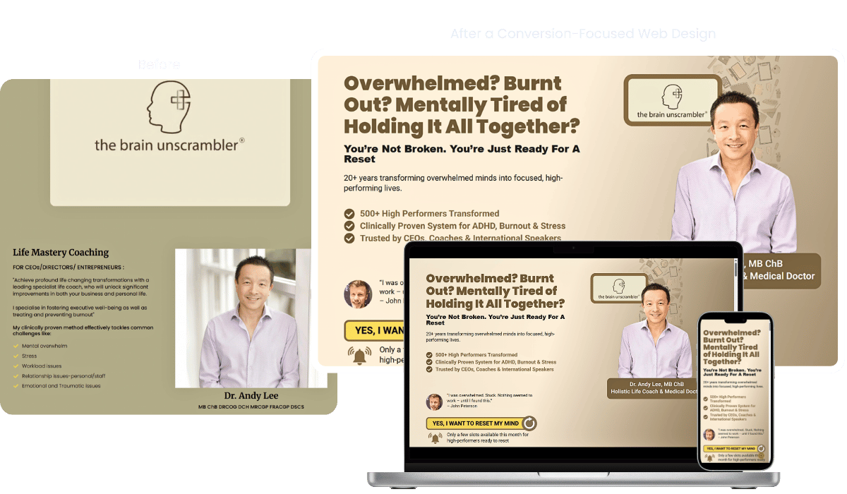
Before
A website that tried to say everything at once
Then the lived experience
The site shared achievements
Media features
And powerful ideas
But for many visitors
It felt heavy
Hard to follow
And unclear where to begin
People scrolled
They respected the credentials
But they hesitated to take the next step
After
A website that leads with clarity and calm
Then the transformation
The message is now simple and human
It speaks directly to overwhelmed professionals
It explains the problem in plain language
And it shows a clear next step without pressure
Visitors no longer need to figure things out
They feel guided
Supported
And ready to move forward
People do not buy coaching.
They buy clarity, relief, and real results.
The website now speaks directly to high performing professionals who feel mentally overwhelmed.
It positions Dr. Andy Lee as the guide they have been looking for.
This is not just better design.
It is a clear and confident path to take action.
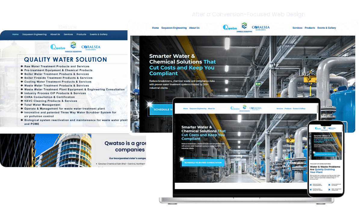
Before
A Website That Looked Busy but Didn’t Work Hard
This website had experience.
It had services.
It had partnerships.
But it was hard to understand.
Visitors had to work to figure out
• What the company actually does
• Who it is best for
• What to do next
The site tried to say everything at once.
Important messages were buried.
Decision makers had to scroll, guess, and piece things together.
For a busy plant manager or operations lead, that creates friction.
And friction costs trust.
After
A Website That Speaks Clearly and Leads Visitors Forward
The new site starts with the real problem.
Water and chemical issues that quietly cost money and cause risk.
From the first screen, visitors now understand
• What problems are being solved
• Who the solutions are for
• Why this company can be trusted
• What the next step should be
The message is structured.
The flow is intentional.
Every section answers one question at a time.
No guessing. No overload.
Why This Works
In industrial businesses, people are not buying services.
They are buying peace of mind.
This site speaks directly to real risks like downtime, fines, and inefficiency, and explains solutions in clear, simple language.
Instead of listing everything Qwatso does, it shows how Qwatso thinks and solves problems.
That clarity builds trust.
And trust is what moves serious buyers forward.
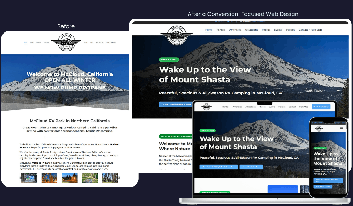
Before
A beautiful location.
But the website didn’t help people book confidently.
The old site had good intentions, but for new visitors it felt:
• Text heavy and hard to scan
• No clear first action
• Important info buried too deep
• More about describing than guiding
• Looked dated on mobile
People had to work to understand:
Where to stay
What to book
What to do next
For a travel business, that friction costs bookings.
After
Clear. Calm. Easy to book.
The new site was rebuilt around how real guests think and decide.
Now visitors can instantly:
• See the experience, not just read about it
• Find the right stay in seconds
• Feel reassured by photos, reviews, and layout
• Book without guessing what to do next
• Browse easily on mobile
Instead of explaining everything at once, the site now guides guests step by step.
The result is a site that feels welcoming, trustworthy, and simple to use.
Why This Works
People don’t book RV parks based on features.
They book based on how easy it feels.
This redesign removes confusion, highlights what matters most, and makes booking feel natural instead of forced.
When the website feels calm, guests feel confident.
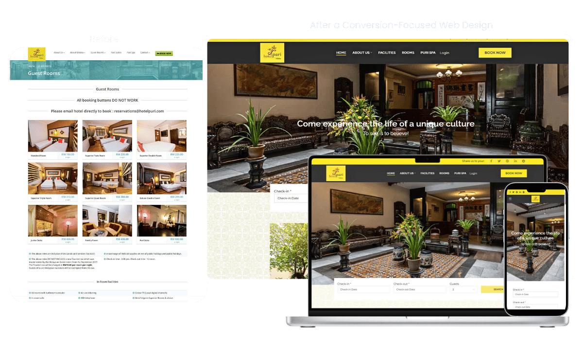
Before
The old website looked full, but it wasn’t working.
Visitors could see the rooms, but they couldn’t book easily.
Some booking buttons didn’t work.
Important information was buried or unclear.
The site felt more like a brochure than a booking tool.
For a hotel, that’s costly.
Every confused visitor is a lost reservation.
After
The new website was rebuilt around one goal.
Make booking easy and stress free.
Now visitors can
• see room options clearly
• understand what makes the hotel special
• and book without friction
The layout is calmer.
The flow makes sense.
The calls to action are clear.
Instead of explaining everything at once the site now guides guests step by step.
The result
• more confidence
• less confusion
• and a website that actually supports daily business.
Why This Works
Small businesses don’t need flashy websites.
They need clarity.
This redesign removed friction, simplified decisions, and aligned the site with how real guests think and book.
When the website feels easy, people act.
After helping hundreds of businesses fix what was not working, here is why I do this differently.
About Me - My Story

I Wasn’t Always a Web Conversion Strategist
I started out stuck.
Just me. A laptop. Overdue bills.
A dream that felt like it was slipping away.
No agency.
No team.
Just a freelancer, trying to figure it out one late night at a time.
The Reality
No blueprint.
No sales skills.
Just hoping the next project covered rent.
I wore every hat.
Designer. Tech support. Marketer. Copywriter.
But deep down, I felt like none of it was working.
There were days I wanted to quit.
Nights I whispered, “Maybe I’m not cut out for this.”
That Struggle Became My Advantage
Over time, I stopped chasing trends and started listening.
Listening to what small business owners really need.
Clear messaging
Websites that bring in leads
Someone who can guide them without the tech speak
I realized I wasn’t just fixing websites.
I was helping people rebuild confidence, clarity, and control.
Still Wondering If This Is Right for You?
How do I know if I even need this audit?
If your website isn’t bringing you steady leads or clients, this audit is for you.
Even if you already have traffic, if those visitors aren’t turning into sales, the audit will show you exactly why.
Is this just another sales pitch?
No.
You’ll actually get a clear, no-fluff PDF showing what’s confusing visitors, why they’re not saying yes, and the quick fixes that will help. You’ll walk away with real insights; whether or not you decide to work with me afterward.
Do you work with my type of business?
Yes.
Over the past 15 years I’ve worked with small businesses, consultants, coaches, Christian brands, and local service providers. The audit is tailored to your website and your goals; not a one-size-fits-all template.
What happens after the audit?
You’ll receive a PDF with findings and fixes, and I’ll also walk you through them if you’d like. From there, you can implement the changes yourself, or if you want my help, I’ll guide you on the best next steps.
How long does it take to see results?
Many clients start seeing improvements in engagement and enquiries as soon as the first changes are applied, sometimes within weeks. Of course, timing depends on your website’s current state and how quickly fixes are made.
What if I already have a web designer?
That’s fine.
You can share my audit with them and have them apply the recommendations. Or, if you prefer, I can take care of it for you; whichever feels easiest.
Ready to See What’s Holding Your Website Back?