See it live: hotelpuri.com
What was going wrong
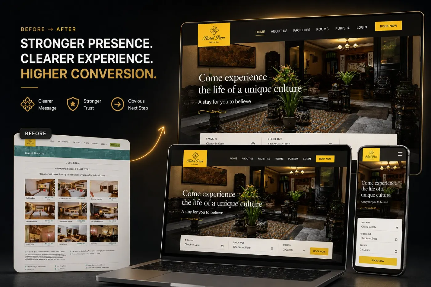
Rooms were visible but hard to book. Some booking buttons didn’t work at all and key information sat out of reach.
What changed
Room options are clear, what makes the hotel special is obvious, and booking is easy. A calmer layout and a simple flow.
Rooms that read clearly
Rooms can be compared side by side, with the differences guests care about made clear.
The hotel’s difference stated
Heritage and character are why guests choose this hotel over a chain. That reason now shows before the price.
Booking without friction
Every booking path tested on real phones and computers, with a calmer layout and a simple flow from interest to confirmed booking.
Why it works
When a site feels easy, people act.
In the client’s words
“Richerd made a real difference to our hotel’s sales. When the new site launched with its new booking engine, our sales grew by 20%. Thank you.”
What to take from this for your own site
You don’t need the same type of business for these to apply. Three lessons that work for almost any small business website.
Going deeper: Why small business websites stop converting.
Your site has a version of this problem
Send me your website link. Within 48 hours you’ll know the three things losing you enquiries.
Get my free audit