
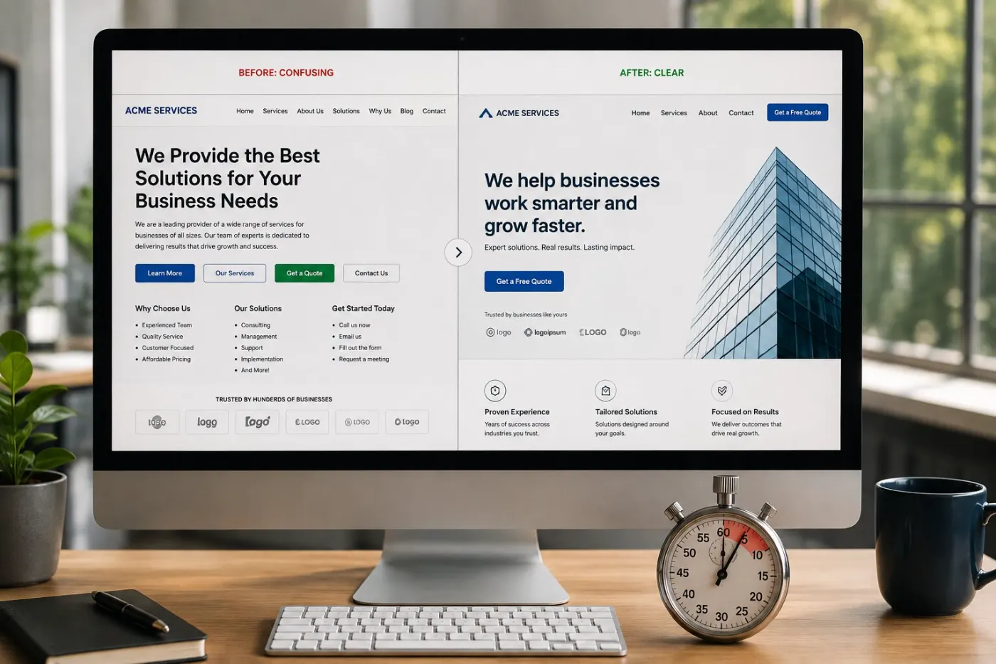
The five-second test
Show your homepage to someone who doesn’t know your business. After five seconds, take it away and ask what you do and for whom. If they can’t say, no design or extra traffic will fix it.
Almost every homepage that fails this test makes the same mistake: it starts by talking about itself.
What goes above the fold
The first screen — what visitors see before scrolling — does most of the work. On a phone, that is a small space. Four things belong there, and very little else.
A big photo is optional. If you use one, show your real work, place or people — never a stock photo of a handshake. It should support the headline, not replace it. (Not sure which photos to use? Read stock photos vs real photos.)
The structure that works
Five sections, in this order. Sequence matters more than word count.
Name the problem, not yourself
The first thing a visitor reads should be a problem they already feel. “Your website gets traffic but no enquiries” works. “Welcome to our website — established 2006” does not. Share your history on the About page.
Say who it is for
Being specific wins work. “For coaches and consultants” tells the right people they are in the right place, and you lose nobody you want. A vague audience brings vague enquiries.
Show what happens next
One main action, repeated where people make decisions. A second competing button doesn’t give more options — it makes the first one weaker.
Put proof where the doubt is
Put reviews where someone thinks “but would this work for me?” — not in a slider at the bottom where nobody looks. Match each review to the doubt next to it.
Cut everything else
If a section doesn’t help the visitor decide, it distracts from the ones that do. This is the hardest step, and it makes the biggest difference.
Quick check: does your homepage pass the five-second test?
5 questions · 30 secondsOpen your website on your phone, then answer honestly.
Swap these lines
Instead of
“Innovative solutions for modern businesses”
Try
“Your website gets visitors. It should be getting enquiries.”
Instead of
“We offer a wide range of services”
Try
“Three things, in order — audit, redesign, growth.”
Instead of
“Learn more”
Try
“Get my free audit” — name what they get, not what they do.
Seven homepage mistakes that cost enquiries
These turn up on most of the small business homepages I review. Each one is cheap to fix.
A rotating slider as the hero
Visitors only see the first slide, and often not even that before it changes. Pick your most important message and keep it still.
“Welcome to our website”
The most wasted line on the internet. Visitors know where they are. They want to know if you can help.
Three or more equal buttons
"Services", "About", "Contact" and "Shop" side by side make the visitor choose for you. Pick one main button; put the rest in the menu.
Services listed without outcomes
“Web design · SEO · Hosting” says what you sell, not why it matters. Add the result each one gives.
Testimonials parked at the bottom
Proof works best next to the claim it supports. Move your best review to just below the first button.
The only contact route is a form at the end
Someone ready to contact you should not have to scroll to the bottom. Repeat the next step after each main section.
No tap-to-call or WhatsApp on mobile
Most small business visitors use a phone. If they can’t reach you in one tap, many won’t try — see how to set WhatsApp up properly.

Write it out loud
The fastest way to write your homepage is to explain your business to a friend over teh tarik and write down what you said. That version is always clearer than what you type — because when you type, you try too hard to sound impressive.
If your homepage still isn’t working after this, the problem is usually elsewhere — see the seven reasons a website stops converting, or four redesigns where this structure was the whole fix.
Check it on your phone first
Write and check your homepage on a phone, not a laptop. On a small screen the headline breaks into more lines, the button moves down, and a three-column section becomes a long scroll. If the message works on a phone, it works everywhere.
Then check the speed. A homepage that takes five seconds to load on mobile data loses visitors before they read your headline — no matter how good it is.
Before you publish: a homepage checklist
Run through this once. Any “no” is your next fix. Tap the ones you already have — your ticks are saved on this device.
0 of 8 in place
Tap each one your site already has.
Common questions
How long should a homepage be?
As long as it takes to move a visitor from problem to decision, and no longer. For most small businesses that is five to seven sections. Length is not the problem — the order is.
Should the homepage explain everything I do?
No. The homepage should send the right visitor to the right next page. Trying to explain every service at once is the most common reason a homepage gets no enquiries.
What should the first sentence say?
Name the problem your visitor already has, in their own words. Not your company history, not a slogan, not an award.
Should I use a slider or carousel on my homepage?
No. Most visitors only see the first slide, and moving content makes the headline harder to read. One clear, still message gets more enquiries than five changing ones.
How often should I update my homepage?
Check it every six months, or whenever your main service, price or customers change. Add newer reviews and results as you get them — fresh proof is the easiest improvement.
Part of the website conversion guide — turning the visitors you already have into enquiries.
When the message got clear
Richard quickly understood what we needed.
He delivered a site that looks excellent and tells our story clearly. Even visitors unfamiliar with our field find it easy to use, and we have seen real growth since.
 Wee Yien Ann
Founder & CEO, Hannve Technology