
See it live: mccloudrvpark.com
What was going wrong
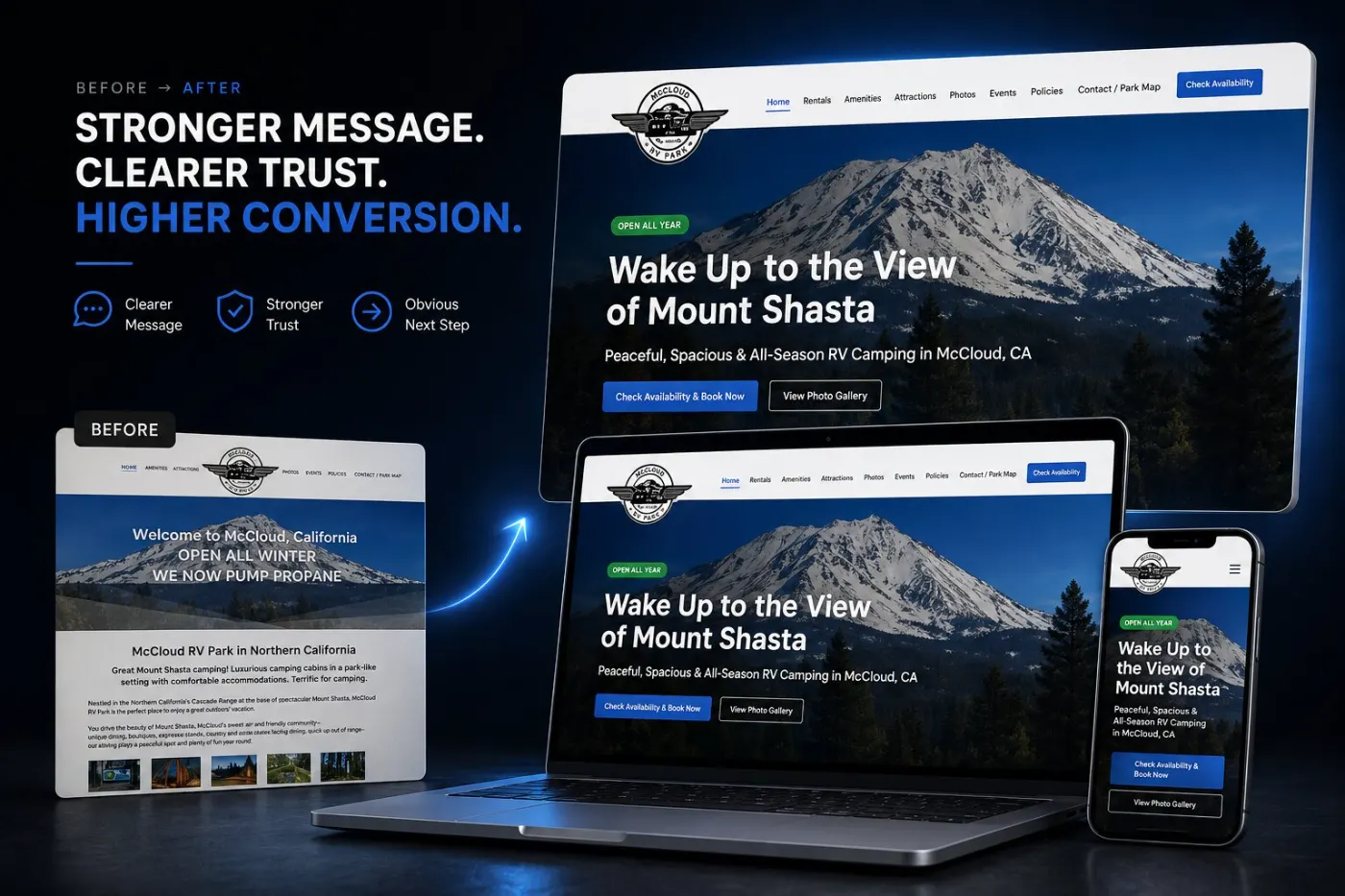
Too much text, no clear first step, important details hidden, and an old look on phones. Guests had to work out where to stay and what to do next.
What changed
Guests see the experience, find the right stay in seconds, and book without guessing — with photos, reviews and a clear layout to reassure them.
The experience comes first
Guests see the place right away — what it feels like to be there — before any talk about price.
The right stay in seconds
Options are easy to compare at a glance, with the important booking details shown right there, not behind links.
Reassurance built into the flow
Photos, reviews and layout answer the hidden worry — will it be as good as it looks? — right when guests think it.
Why it works
People don’t book on features. They book on how easy it feels.
What to take from this for your own site
You don’t need the same type of business for these to apply. Three lessons that work for almost any small business website.
Going deeper: Why small business websites stop converting.
Your site has a version of this problem
Send me your website link. Within 48 hours you’ll know the three things losing you enquiries.
Get my free audit