Visitors can’t tell what you do in five seconds
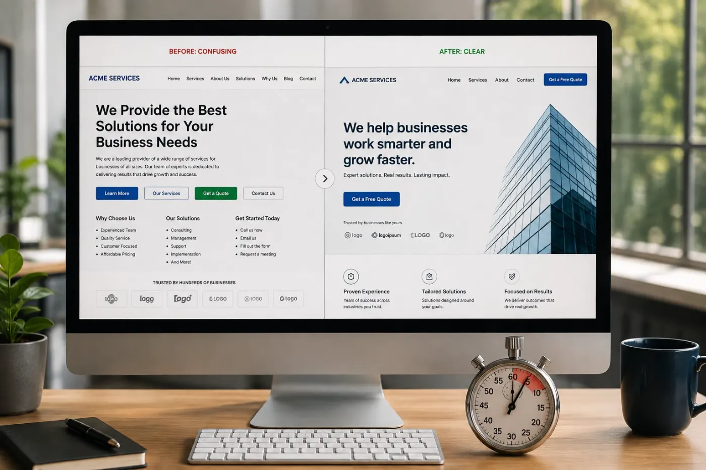
This is the most common reason, and the most costly. If your first screen says something like “Empowering businesses to reach their potential,” visitors have to work out what it means. Most won’t. They leave while still wondering if they are in the right place.
Check it yourself
Show your homepage to someone outside your industry for five seconds, then hide it. Ask what you sell and who it’s for. If they hesitate, this is your problem — and fixing anything else first is a waste of time.
You’re speaking to everyone, so you land with no one
Broadening your message to avoid excluding anyone is the instinct that kills the most enquiries. “We help businesses of all sizes” reads as “we help nobody in particular.” The visitor is looking for evidence you understand their situation, and generic copy gives them none.
Check it yourself
Could a competitor copy your homepage text onto their site and it still makes sense? If yes, it is not specific enough to be believed.
The next step is too big an ask
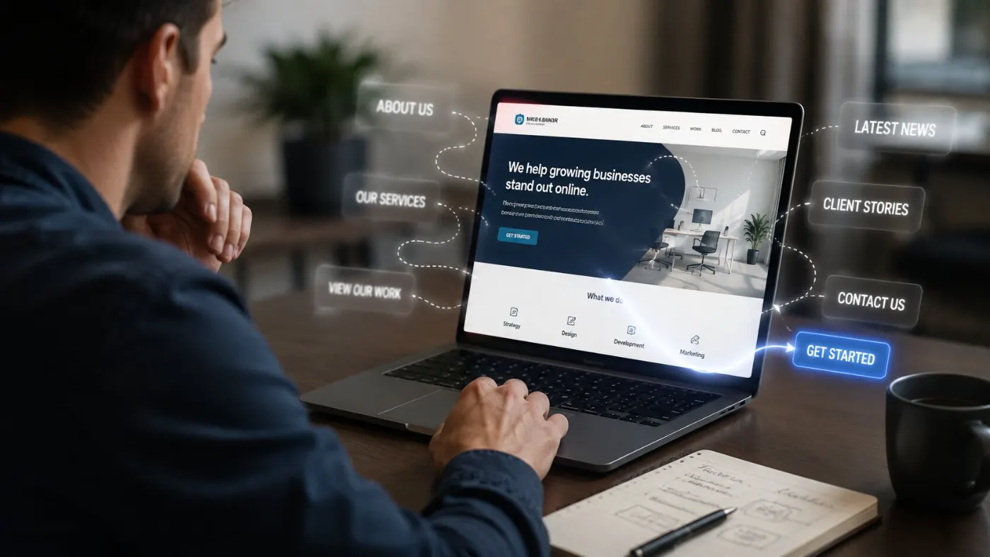
“Book a consultation” asks a stranger for their time, a commitment and a possible sales talk — before they trust you. A first-time visitor almost never says yes. It looks like a traffic problem, but really you are asking for too much, too soon.
Check it yourself
Count what your main button asks for: time, money, a phone call, a decision. If it is more than one, offer a smaller step too — something useful they can get without talking to you.
Proof arrives after the decision, not before it
Reviews at the bottom of the page are proof nobody sees. By the time visitors scroll that far, they have already decided if they trust you. Proof must appear when they have doubts — next to the price, the button, and the claim it supports.
Check it yourself
Scroll to your main button. Is there any proof on the same screen — a client name, a result, a face? If not, you are asking for trust you haven’t earned yet.
The site is slow, and slow reads as unprofessional
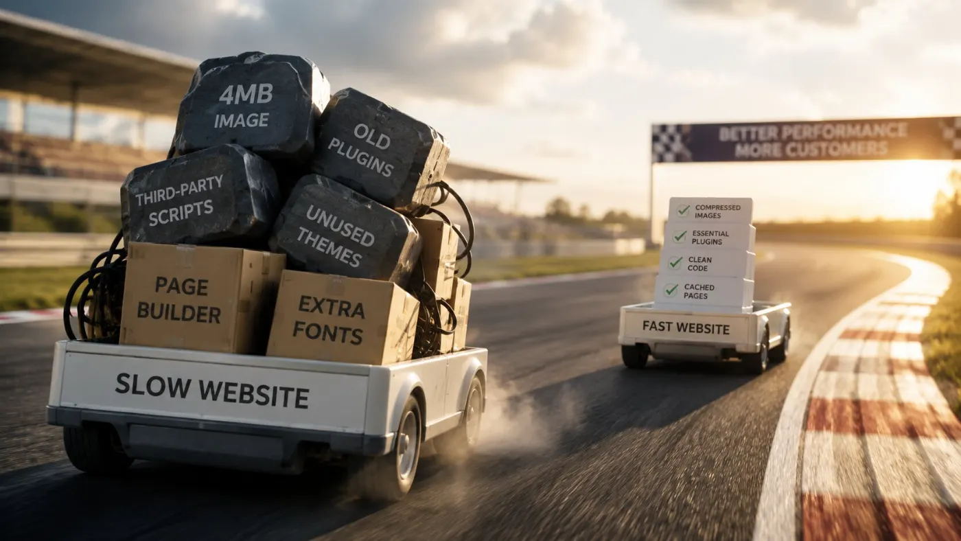
Speed is not just a technical problem. A page that takes four seconds to load looks uncared for before anyone reads a word, and on mobile data many visitors leave before they see your site. Large images and heavy page builders cause most of it.
Check it yourself
Open your homepage on mobile data, not office Wi-Fi. If you notice the wait, everyone else does too. Test it with GTmetrix or PageSpeed Insights for the specifics.
Mobile was an afterthought
Most visitors use a phone, but most websites are still designed on a computer and checked on a phone later. Buttons end up too small, forms too long, and important information hidden after three screens of scrolling. The computer version works fine; the phone version people really use does not.
Check it yourself
Open your site on your phone and try to contact yourself using one thumb. Every small difficulty you feel is much worse for a stranger with no reason to keep trying.
You redesigned the surface, not the message
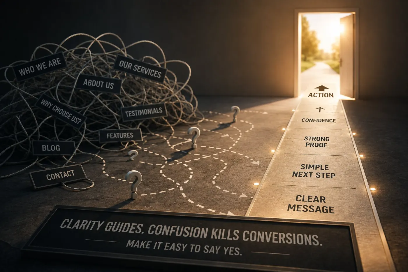
This is why a redesign often changes nothing, however much it cost. New colours, new layout, new photos — but the same unclear message. A website is not a brochure that needs to look modern; it needs to be understood. If the message was never clear, a new look just makes the confusion prettier. Before paying for one, check what a fair website redesign cost looks like, and what it should change.
Check it yourself
Write one sentence: what you want visitors to understand and do. Then look for that sentence on your homepage. If it isn’t there in simple words, no redesign will fix it.
Quick check: which of the seven is yours?
5 questions · 30 secondsOpen your website on your phone, then answer honestly.
Fix them in this order
The order matters more than the list. Each one depends on the one above — a faster site with an unclear message just confuses people faster.
Common questions
How do I know if my website is not converting?
Compare enquiries with visitors over the last 90 days. Fewer than 1 enquiry for every 100 visitors, steady traffic with a quiet phone, or people opening your contact page without sending the form all point to a conversion problem, not a traffic problem.
What should I fix first when my website isn’t converting?
The headline. If visitors don’t understand what you do, nothing below it matters. Then make one clear next step, then put proof right next to it. Speed and design come after those three.
Why does my website get traffic but no enquiries?
Usually one of three things: visitors can’t tell what you do in a few seconds, the next step asks too much too soon, or there is no proof where they decide. Traffic is rarely the problem — the page is.
How quickly should a visitor understand what I do?
Within about five seconds. Your headline should say what you do, who it’s for and where, in simple words. If a stranger has to scroll or guess, most will leave.
What is a good conversion rate for a small business website?
For a service business, 1–3 enquiries for every 100 visitors is normal. Always below 1 in 100 usually means a problem with the message or next step, not the traffic.
Do I need a full redesign to fix conversions?
Usually not. Most problems are fixed by rewriting the headline, making the main button simpler and moving proof higher — changing the words and order, not the whole site. Only redesign when the site itself is the problem.
Does website speed really affect enquiries?
Yes. Every extra second on a phone loses visitors before they read anything, and a slow site looks unprofessional. Fix speed after the message and the next step, so the visitors who stay see something worth acting on.
How do I find out which problem my website has?
Look at your homepage like a stranger would, using the five checks above in order. Or send it for a free audit and get the three problems on your site, in the order to fix them.
One owner who was here too
This website audit gave me clarity and confidence.
After applying his advice, I received more discovery calls and finally felt clear about how to present my work and attract the right clients.
 Carrie Elizabeth
Integrative Health Coach